Take full advantage of mobile traffic with the Mobile Layouts add-on. The Mobile Layouts add-on is a complete and easy solution to have a website with custom layouts for different types of devices. Make your web store look beautiful and responsive on desktop, mobile, and tablet devices in a snap.
Efficiency for the store
• Increase the traffic of your site
• Adapt the store to mobile devices
• Increase conversion of your site
How the product works
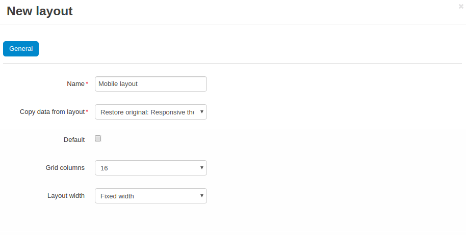
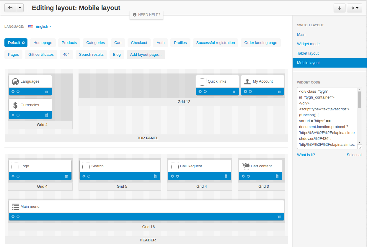
Once you have installed the add-on, you can create layouts which you want to display for different devices. You can set up custom pages on your site, used only for mobile devices, tablets or desktops.
Trial Version
Trial version provides you an add-on with full set of features for the period from 3 days to month in depence on condition of the specific vendor. The add-on will be disabled when the trial perod is expired. In case the add-on has a free version, when the trial period is expired, the add-on functionality will be limited in accordance with abilities of the free version. Purchase a subscribtion to the add-on in order to restore the full functionality of the add-on.
Freemium Version
Not available
Free version provides you an ability to use the add-on permanently on special condition. Technical support and individual customization services are not available and the add-on functionality, abilities and adaptation to new cs-cart versions are heavily limited. Purchase the add-on subscription or the lifetime version to get the fully functional add-on version.
By subscription
Available
By purchasing the subscription to the add-on you get the latest version of the add-on. Full functionality of the add-on, its future updates, individual customization and limited amount of free technical support service are available during the subscription period. When the subscription period is expired, the add-on will be disabled on your store. In case the add-on has a “Free Version”, the add-on won’t be disabled but most of its features, technical support services and many other advantages will no longer be available.
Lifetime Version
Available
This subscription type provides a permanent, fully functional version of the add-on. You won’t have to bother with prolongation of subscription, and technical support service will be unlimited for you. Basically, this subscription type is demanded, in case the fully functional add-on version has been previously used, and you have made a certain conclusions about its purpose and efficiency.
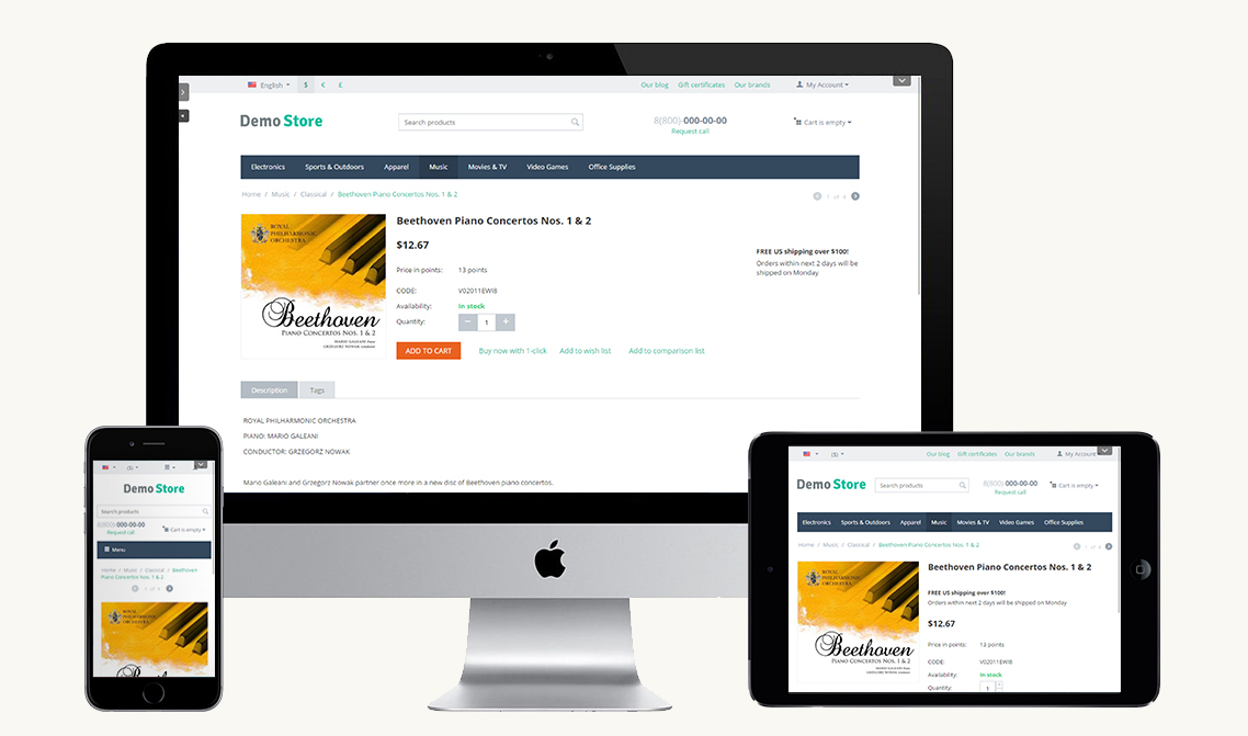
Storefront view
Admin panel view
Settings view
Storefront view
Admin panel view
Settings view
Demo instruction
Open the demostore by clicking the button at the bottom of the page
Open the add-on settings in the Addons section of the Admin panel and make sure the the add-on is active
Open the Layout design page (Design->Layouts) and proceed to Mobile, Tablet layout
Observe or alter the layout settings
Open the storefront from the mobile device
Storefront will be displayed in accordance to the settings
This addon is value for money, making browsing our webshop on mobile devices much more user friendly for our customers.
Pros:
- Easy installation
- Easy configuration
- Does what it needs to do
Cons:
- You still need people to configurate, but it's worth it.
Danny Osterberger
Comment
This addon is a must-have for all E-commerce site, 60% of our sales now go moblie. It is great being able to improve the user experience.
erol
Comment
If you do not have it - GO GET IT. This is one of addons that can help you get much closer to mobile customers, and they will return in more mobile sales My mobile sale increase 30% bec of this addon..
Anton
Comment
Хороший аддон, помог временно решить вопрос с отдельным дизайном для мобильных устройств. Далее уже не спеша перешли на адаптивную тему :)
Fevzi
Comment
Точное определение мобильных и планшетов. Не нужно создавать несколько блоков и скрывать их в макете в зависимости от разрешения, что не очень полезно для SEO. Достаточно создать несколько макетов со своим наборов блоков под каждое устройство. Таким образом, на мобильных будет выглядеть сайт гораздо презентабельнее, нежели просто при обычной адаптации в зависимости от разрешения.
tom
Comment
I have purchased a lot of different addons from varoius developers. And only when I have finally got to SIMTECH i understood what paing attention to details and great customer servise is! Simtech is not only selling their great products but also making sure all works as needed in your store.
Most of my clients buy via mobile. Of course I want they experience to be as the best as only possible- this addon saves my time, and makes the site to be mobile-frendly!
Alaa
Comment
The addon is working well. It is an important addon. Using this addon, I was able to create mobile version of my store.
Hossein
Comment
Thank you very much for this add-ons now we can manage our site better for different devices.
Madhupani Jayasuriya
Comment
I am currently using many many add ons developed by Simtech in my online market platform and I am thrilled by the functionality of all of them. No exception to this add on. You will have the option to customize your layouts according to the requirements of the devise used by customers. Nowadays, a significant fraction of customers use mobile devises for online shopping. I strongly recommend Simtech Products and you wont be disappointed since their customer service is excellent!
Кирилл
Comment
Модуль позволяет гибко использовать всю мощь CS-Carta с Макетами для десктопной и Мобильной версий, не углубляясь в дебри: ставите модуль и мобильный макет работает, вы его настраиваете под себя!
Круто!
Рекомендую!


